What the Line of a Motion Graph Says
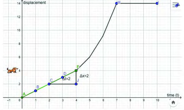
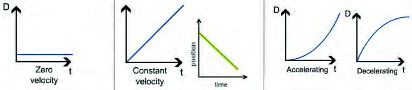
The whole story of a body's motion can be read from one graph. A displacement time graph keeps time on the x-axis and displacement on the y-axis. If the line runs parallel to the x-axis, time keeps passing but the distance covered does not grow, so the body is at rest. A straight line with a slope shows the body covering equal distances in equal intervals of time, which is uniform motion. If the line is a curve, the motion is non-uniform.
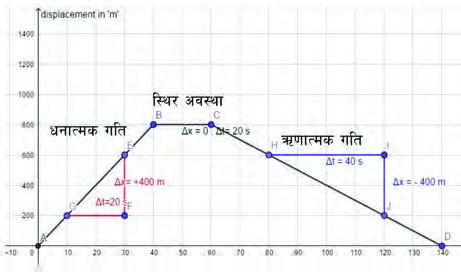
Slope is how we measure what the line is saying. Take any two points on the line, find the change in displacement between them, and divide it by the time taken. That quotient is the slope. On a straight line the slope comes out the same whichever two points are taken, so the motion is uniform. On a curve the slope is different at different points, so the motion is non-uniform.
Remembering these as shapes makes any graph quick to read. A flat line, a rising line, a falling line and a curve each announce a different kind of motion.
The Velocity Time Graph
A graph that shows the relation between the velocity of a body and the corresponding time is called a velocity time (v - t) graph.
A velocity time graph places time on the x-axis and velocity on the y-axis. By observing such a graph we can tell whether the body is at rest, moving ahead with uniform velocity, or about to stop. A displacement time graph tells where the body has reached; a velocity time graph tells how fast it is moving and how that fastness itself is changing.
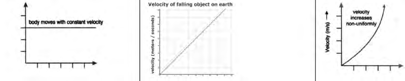
On a displacement time graph a line parallel to the x-axis means the body is at rest. On a velocity time graph the same flat line means the body is moving with uniform velocity. For a body to be at rest on a velocity time graph, the line must lie on the x-axis itself, at \( v = 0 \).
Slope Means Acceleration
The slope of a velocity time line gives the acceleration of the moving body.
The slope is found the same way as before, but with velocity on the y-axis the quotient now means something new. Divide the change in velocity \( \Delta v \) between any two points of the line by the time \( \Delta t \) taken for it, and the result is the acceleration:
\[ a = \frac{\Delta v}{\Delta t} \]
Comparing the slopes of two velocity time lines tells us the difference in their rates of change of velocity. The steeper of the two lines belongs to the body whose velocity is changing faster.
Four Shapes of the Velocity Time Line
A velocity time line parallel to the x-axis shows that the velocity does not change as time passes, so the body moves with uniform velocity and zero acceleration. A straight sloping line shows the body moving with uniform acceleration. A body falling freely from a certain height is a good example, because its velocity grows at the rate of 9.8 m/s every second. If the straight line runs downhill, the velocity is decreasing by an equal amount each second, and this is called retardation. If the velocity time line is a curve, the rate of change of velocity is itself not steady, so the acceleration is non-uniform.
| Shape of the line | State of the motion | Acceleration |
| Flat line parallel to the x-axis | Velocity unchanged, uniform velocity | Zero |
| Straight rising line | Velocity grows by an equal amount each second | Uniform acceleration |
| Straight falling line | Velocity drops by an equal amount each second | Uniform retardation |
| Curved line | The rate of change of velocity is not steady | Non-uniform acceleration |
A falling line on a velocity time graph does not mean the body is going downhill or moving backwards. It only means the velocity is decreasing. This graph says nothing about the direction of travel.
From a Data Table to a Graph
To turn a table of data into a graph, put each velocity as a point above its own time and join the points. If a motorcycle running along a straight road keeps a velocity of 5 m/s at every second, all the points sit at the same height and the line comes out flat, parallel to the x-axis. That is the graph of uniform velocity.
A freely falling body's velocity runs 0, 9.8, 19.6, 29.4, 39.2 and reaches 49 m/s. Joined up, the points make a straight rising line. Taking the whole five second interval, the slope works out as:
\[ a = \frac{49 \text{ m/s} - 0 \text{ m/s}}{5 \text{ s} - 0 \text{ s}} = 9.8 \text{ m/s}^2 \]
An aeroplane starting its take off run shows velocities of 0, 2, 6, 12, 20 and 30 m/s. It gains 2 m/s in the first second, 4 m/s in the next and 6 m/s in the third, so the gain itself keeps growing. Since equal times do not add equal velocity, the graph comes out as a curve and the acceleration is non-uniform.
Reading a Graph Piece by Piece
On a real journey a body sometimes speeds up, sometimes runs steadily and sometimes slows down. So a real velocity time graph is made of several pieces joined together. To read such a graph, each piece is examined on its own, and the shape and slope of each piece names the motion of that interval.
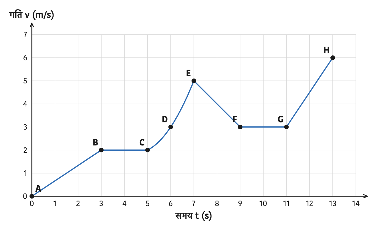
- Piece AB: a straight rise from 0 to 2 m/s, so uniform acceleration.
- Piece BC: a flat line holding 2 m/s, so uniform velocity.
- From C through D to E: a curved line whose rate of change keeps changing, so non-uniform acceleration.
- Piece EF: a falling line, from 5 m/s down to 3 m/s, so retardation.
- Piece FG: flat again at 3 m/s, so uniform velocity.
- Piece GH: the steepest straight rise, so the largest uniform acceleration.
In both AB and GH the line is a straight rise, so both carry uniform acceleration. But the slope of the velocity time line in GH is greater than in AB. So we can tell that the body's velocity changes more rapidly in the piece GH.
The full lesson is waiting for you
The notes are free to read in full. A free account opens the rest of the practice, and tracks your progress and confidence score for every subject. Presentations and videos need approval from Learn Yeti.