The Five Numbers Behind a Box Plot
A whisker box plot, also called a box and whisker plot or simply a box plot, shows a whole set of data with only five numbers. They are the lowest value, the first quartile \( Q_1 \), the median \( M_d \), the third quartile \( Q_3 \) and the highest value. Together these five numbers are called the five-number summary of the data.
Whisker box plot: a graph drawn above a number line that shows a data set by its lowest value, first quartile, median, third quartile and highest value. A box is drawn from \( Q_1 \) to \( Q_3 \), a line inside the box marks the median, and two lines called whiskers reach out to the lowest and the highest values.
Here is a box plot of the ages of a group of students. The youngest student is 10 years old, \( Q_1 \) is 11 years, the median is 13 years, \( Q_3 \) is 16 years and the oldest student is 18 years old.
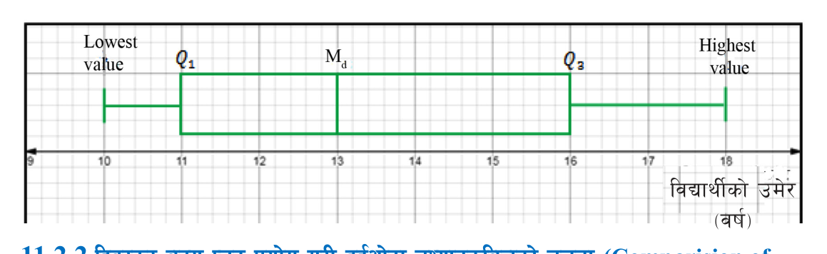
Read the plot from left to right. The left whisker runs from 10 to 11, so the youngest quarter of the students are between 10 and 11 years old. The box runs from 11 to 16, so the middle half of the students are between 11 and 16 years old. The line inside the box stands at 13. Half the students are 13 or younger and half are 13 or older. The right whisker runs from 16 to 18 and holds the oldest quarter.
Interquartile range (IQR): the difference between the third quartile and the first quartile. On a box plot it is the length of the box, and it shows how widely the middle 50% of the data are spread.
\[ \text{IQR} = Q_3 - Q_1 \]
Range: the difference between the highest value and the lowest value. On a box plot it is the distance from the end of one whisker to the end of the other.
For the ages of the students, the interquartile range is \( 16 - 11 = 5 \) years and the range is \( 18 - 10 = 8 \) years.
Comparing Two Data Sets with Box Plots
One box plot describes one data set. Box plots become really useful when two data sets are drawn one above the other on the same number line. Then a single look tells you which set has bigger values and which set is steadier. Two measures are used for the comparison.
- The median. It is the middle value, so it tells us the typical or average value of each data set. The set whose median line sits further to the right has larger values in general.
- The interquartile range. It is the length of the box. A long box means the middle half of the values are spread far apart, so the data vary a lot. A short box means the middle half of the values are close together, so the data are steady.
Variation: how much the values of a data set differ from one another. A larger interquartile range means greater variation.
Consistency: how steady the values of a data set are, that is, how close they stay to one another. Greater variation means less consistency, and smaller variation means more consistency.
Larger median: larger typical value. Larger interquartile range: more variation and less consistency. Smaller interquartile range: less variation and more consistency.
Draw both box plots on the same scale. If each plot has its own scale, the lengths of the boxes and the positions of the median lines cannot be compared at all.
Finding the Quartiles of Individual Data
Before any plot can be drawn, the five numbers must be found. For individual data with N values, first arrange the values in ascending order. The lowest value is then the first number and the highest value is the last number. The quartiles and the median are found by their positions in the arranged list.
\[ Q_1 = \left(\frac{N+1}{4}\right)^{\text{th}} \text{ term} \]
\[ M_d = \left(\frac{2(N+1)}{4}\right)^{\text{th}} \text{ term} \]
\[ Q_3 = \left(\frac{3(N+1)}{4}\right)^{\text{th}} \text{ term} \]
Each formula gives a position, not a value. If the formula gives 3, then \( Q_1 \) is the third number in the arranged list.
Arrange the data in ascending order before counting positions. The third number of an unarranged list is just a number from the list, not the first quartile.
Worked Example: Scores of Two Cricket Players
Two cricket players scored the following runs in their last eleven matches.
| Player | Runs in the last eleven matches |
| Player A | 21, 25, 71, 5, 42, 15, 85, 64, 110, 32, 35 |
| Player B | 12, 55, 101, 34, 60, 41, 72, 6, 22, 7, 18 |
We will find the lowest value, first quartile, median, third quartile and highest value of each data set, draw the two box plots, and then compare the players using the median and the interquartile range.
Five Numbers for Player A
Step 1: Arranging Player A's scores in ascending order gives 5, 15, 21, 25, 32, 35, 42, 64, 71, 85, 110. Counting the scores:
\[ N = 11 \]
Step 2: Reading the two ends of the arranged list, the lowest value is 5 and the highest value is 110.
Step 3: Finding the position of the first quartile:
\[ \frac{N+1}{4} = \frac{11+1}{4} = \frac{12}{4} = 3 \]
Step 4: The 3rd term of the arranged list is 21, so:
\[ Q_1 = 21 \]
Step 5: Finding the position of the median:
\[ \frac{2(N+1)}{4} = \frac{2 \times 12}{4} = 6 \]
Step 6: The 6th term of the arranged list is 35, so:
\[ M_d = 35 \]
Step 7: Finding the position of the third quartile:
\[ \frac{3(N+1)}{4} = \frac{3 \times 12}{4} = 9 \]
Step 8: The 9th term of the arranged list is 71, so:
\[ Q_3 = 71 \]
Five Numbers for Player B
Step 1: Arranging Player B's scores in ascending order gives 6, 7, 12, 18, 22, 34, 41, 55, 60, 72, 101. Player B also has 11 scores, so \( N = 11 \) and the positions are the same as for Player A: the 3rd, 6th and 9th terms.
Step 2: Reading the two ends of the arranged list, the lowest value is 6 and the highest value is 101.
Step 3: The first quartile is the 3rd term:
\[ Q_1 = 12 \]
Step 4: The median is the 6th term:
\[ M_d = 34 \]
Step 5: The third quartile is the 9th term:
\[ Q_3 = 60 \]
Putting the two five-number summaries side by side makes the drawing and the comparison easier.
| Measure | Player A | Player B |
| Lowest value | 5 | 6 |
| First quartile | 21 | 12 |
| Median | 35 | 34 |
| Third quartile | 71 | 60 |
| Highest value | 110 | 101 |
Drawing the Two Box Plots
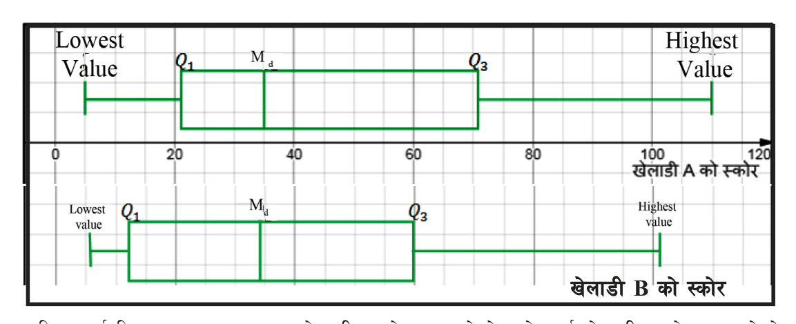
Both plots must share one horizontal scale. The scores run from 5 to 110, so a scale from 0 to 120 with a mark every 20 runs holds both players comfortably. Draw on graph paper and follow these steps.
- Step 1: Draw a horizontal number line from 0 to 120 and label it with the runs scored.
- Step 2: For Player A, draw short vertical lines above the number line at 5, 21, 35, 71 and 110.
- Step 3: Join the tops and the bottoms of the lines at 21 and 71 to make the box. The line at 35 stays inside the box as the median line.
- Step 4: Draw the whiskers: one horizontal line from 5 to the left edge of the box, and one from the right edge of the box to 110.
- Step 5: Repeat the same steps for Player B at 6, 12, 34, 60 and 101, directly below Player A's plot and using the same scale.
Comparing on the Basis of the Median
The median score of Player A is 35 and the median score of Player B is 34. In the two plots, Player A's median line sits a little to the right of Player B's. So the average score of Player A is more than the average score of Player B. The difference is only one run, so in their typical innings the two players score almost equally.
Comparing on the Basis of the Interquartile Range
Step 1: Subtracting Player A's first quartile from the third quartile:
\[ \text{IQR of A} = 71 - 21 = 50 \]
Step 2: Subtracting Player B's first quartile from the third quartile:
\[ \text{IQR of B} = 60 - 12 = 48 \]
Step 3: Comparing the two results. The interquartile range of Player A (50) is greater than that of Player B (48), and Player A's box is the longer one. So there is more variation in Player A's scores than in Player B's. In other words, Player A's scores are less consistent than Player B's, and Player B is the steadier batsman.
A full comparison uses both measures. Here Player A has the slightly higher median, but Player B has the smaller interquartile range and is more consistent.
Reading a Comparison from a Printed Box Plot
Often the box plots are already drawn and the task is to read them. Many printed charts lay the plots sideways, one above the other, with the scale along the bottom. The thick line inside each box is the median. To read any of the five numbers, drop your eye straight down from that part of the plot to the scale.
The chart below compares how many hours the batteries of two smartphone brands last.
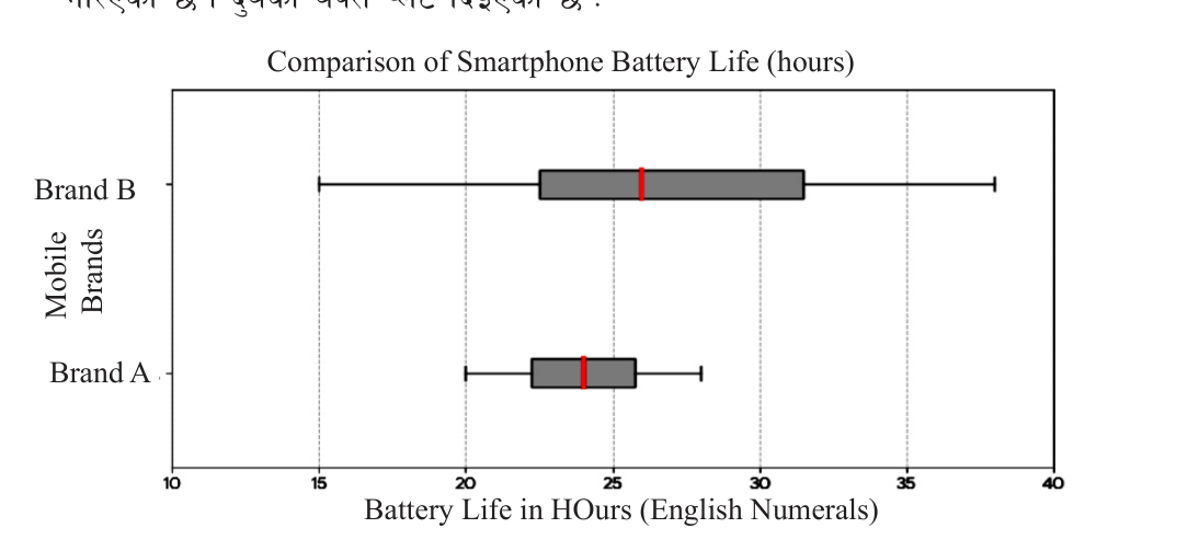
Brand A's whiskers run from 20 hours to 28 hours, its box runs from about 22 hours to about 26 hours, and its median line stands at 24 hours. Brand B's whiskers run from 15 hours to 38 hours, its box runs from about 22.5 hours to about 31.5 hours, and its median line stands at 26 hours.
- Median: Brand B's median line is further to the right, so a typical Brand B battery lasts longer.
- Interquartile range: Brand A's box is much shorter, so its battery lives are close together and Brand A is more consistent.
- Lowest value: Brand A's left whisker starts at 20 hours while Brand B's starts at 15 hours, so a Brand A battery is more certain to last at least a fairly long time.
Short Box, Long Box: Judging Risk
When a decision depends on getting a steady result every time, the length of the box matters more than the median. The next chart shows the rice harvest, in kilograms, over ten years with two different fertilizers.
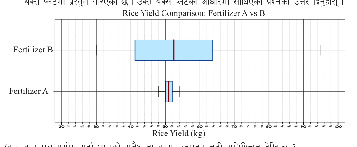
The two median lines stand at almost the same place, a little above 50 kg. The boxes are very different. Fertilizer A's box is only about 2 kg long, so its harvest hardly changes from year to year. Fertilizer B's box is more than 20 kg long, so in some years the harvest is much larger and in others much smaller. A very short box means low risk; a very long box means the result is hard to predict.
Using the Whiskers: Range and Extreme Values
The whiskers carry information the box does not. The end of the left whisker is the lowest value, so it tells us the worst result that happened. The end of the right whisker is the highest value. The distance between the two ends is the range. A whisker that is much longer than the box usually means one or two values were unusually far from the rest.
The chart below compares the battery life, in hours, of two batteries. Read the ends of each whisker to find its range.
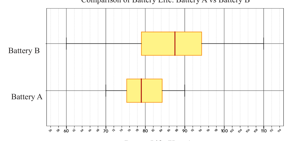
Battery A's whiskers end at 70 hours and 90 hours, so its range is \( 90 - 70 = 20 \) hours. The same subtraction on Battery B's whisker ends gives its range. A buyer who wants the longest typical life looks at the median lines; a buyer who wants no nasty surprises looks at the box lengths and the left whiskers.
What Each Part of a Box Plot Tells You
| Part of the plot | What it tells you when comparing |
| Median line | The typical value. Further right means larger values in general. |
| Length of the box | The interquartile range. Shorter means less variation and more consistency. |
| End of the left whisker | The lowest value, the least that was ever obtained. |
| End of the right whisker | The highest value, the most that was ever obtained. |
| Whisker end to whisker end | The range of the whole data set. |
| One whisker much longer than the box | An unusually large or small value in the data. |
The full lesson is waiting for you
The notes are free to read in full. A free account opens the rest of the practice, and tracks your progress and confidence score for every subject. Presentations and videos need approval from Learn Yeti.