What a Picture of Data Tells You
The numbers we collect about something are called data. A long list of numbers is slow to read, but the same numbers drawn as a picture tell you at once which value is big, which is small and how much there is altogether. That is why statistics uses tables, bar diagrams, line graphs and circular charts.
A school handed out library books to its classes from four up to ten. The table below shows how many books each class received.
| Class | Books received |
| Four | 30 |
| Five | 36 |
| Six | 50 |
| Seven | 44 |
| Eight | 40 |
| Nine | 36 |
| Ten | 30 |
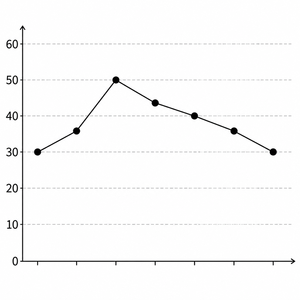
The highest point of the line graph stands over class six, so class six received the most, 50 books. The lowest points stand over classes four and ten, and both received 30. Classes five and nine received the same number, 36 each. To find the total we add every value.
\[ 30 + 36 + 50 + 44 + 40 + 36 + 30 \]
\[ = 266 \]
The same data can be put into a frequency table and drawn as a bar diagram, where the height of each bar stands for the count. But when the question is what share of the whole each class received, a circular chart answers better than bars, because in a circular chart the whole circle is the total.
One set of data can be dressed in many different pictures. The question you are asking decides which picture to choose.
Reading a Pie Chart
In a pie chart one whole circle is cut into pieces. Each piece belongs to one heading, and the size of the piece follows the value of that heading. The chart below splits one year of Gyanendra's family spending into four headings.
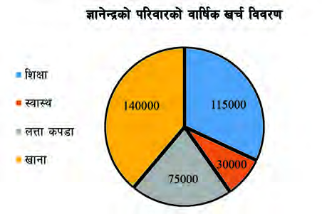
The chart can be read straight off. Education took Rs 115000, health Rs 30000, clothing Rs 75000 and food Rs 140000. Adding all four gives the family's spending for the whole year.
\[ 115000 + 30000 + 75000 + 140000 \]
\[ = 360000 \]
Food took the most and health took the least. The food sector is the biggest piece and the health sector the smallest, so the order can be guessed from the picture even before the numbers are read.
The share a heading takes can be stated as a percentage of the total. For education it works out like this:
\[ \frac{115000}{360000} \times 100\% = 31.9\% \]
Repeating the same step for the other headings builds the table below.
| Heading | Spending (Rs) | Percentage |
| Education | 115000 | 31.9% |
| Health | 30000 | 8.3% |
| Clothing | 75000 | 20.8% |
| Food | 140000 | 38.9% |
If the food spending is spread evenly over the year, one month's food bill comes from dividing the yearly amount by 12.
\[ \frac{140000}{12} = 11666.67 \]
So about Rs 11666.67 goes on food each month. If the family also saves Rs 2,35,000 in the bank after all this spending, its income is the spending plus the saving.
\[ 360000 + 235000 = 595000 \]
So the family's yearly income is Rs 5,95,000.
Pie chart: a chart in which one whole circle stands for the whole of the data, and each heading is shown as a sector of that circle.
Sector: the part of a circle enclosed by two radii and the arc between them. Every slice of a pie chart is a sector.
How a Pie Chart Is Drawn
The angle at the centre of a circle is 360°. In a pie chart this whole 360° stands for the whole of the data. So we set the total equal to 360° and work out how many degrees each heading deserves. Writing the total as \( T \) and the value of one heading as \( V \), the angle \( \theta \) of that heading is found like this.
\[ \theta = \frac{360^\circ}{T} \times V \]
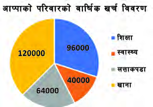
Appa's family spending for a year is listed below under headings. We will turn it into a pie chart.
| Heading | Spending (Rs) |
| Education | 96,000 |
| Health | 40,000 |
| Clothing | 64,000 |
| Food | 1,20,000 |
Step 1: Adding the four amounts to get the total spending:
\[ 96000 + 40000 + 64000 + 120000 \]
\[ = 320000 \]
Step 2: Setting Rs 3,20,000 equal to 360°, the angle that one rupee deserves is:
\[ \frac{360^\circ}{320000} \]
Step 3: Multiplying that rate by the Rs 96000 spent on education gives the education angle:
\[ \frac{360^\circ}{320000} \times 96000 = 108^\circ \]
Step 4: Applying the same rate to the Rs 40000 spent on health:
\[ \frac{360^\circ}{320000} \times 40000 = 45^\circ \]
Step 5: For the Rs 64000 spent on clothing:
\[ \frac{360^\circ}{320000} \times 64000 = 72^\circ \]
Step 6: For the Rs 1,20,000 spent on food:
\[ \frac{360^\circ}{320000} \times 120000 = 135^\circ \]
Step 7: Checking by adding all four angles:
\[ 108^\circ + 45^\circ + 72^\circ + 135^\circ = 360^\circ \]
The four angles add to exactly 360°, so the working is right. The calculated angles are collected below.
| Heading | Spending (Rs) | Angle |
| Education | 96,000 | 108° |
| Health | 40,000 | 45° |
| Clothing | 64,000 | 72° |
| Food | 1,20,000 | 135° |
| Total | 3,20,000 | 360° |
Once the angles are known, only the drawing is left. Work through the steps below in order.
- Find the total of the given data.
- Set the total equal to 360° and work out the angle of every heading.
- Draw a circle of any convenient radius and draw one radius in it.
- Taking that radius as the base line, use a protractor to mark off the heading angles one after another.
- Colour each sector differently and show which colour belongs to which heading in a key.
- Write the title of the chart. The pie chart is now finished.
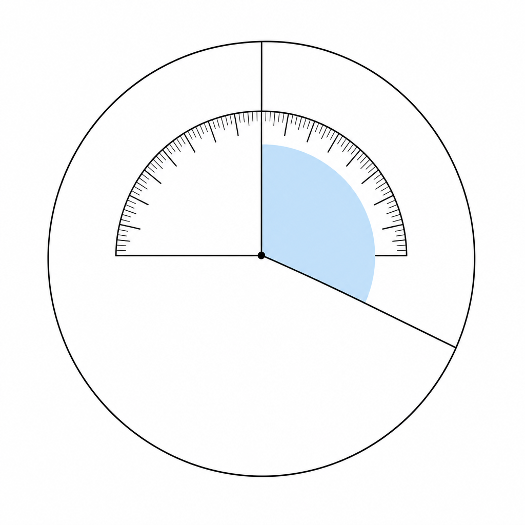
Once every angle is marked and the sectors are coloured and labelled, the finished chart looks like this.
When the Data Are Given as Percentages
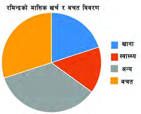
Sometimes the data arrive as percentages instead of amounts. Then the total is 100%, and that 100% has to be shared over 360°. Ramindra's month goes 20% on food, 15% on health, 35% on other things and 30% into savings.
Step 1: The whole income of 100% must fill 360°, so the angle for 1% is:
\[ \frac{360^\circ}{100} = \left(\frac{18}{5}\right)^\circ \]
Step 2: Multiplying that rate by the 20% spent on food:
\[ \left(\frac{18}{5}\right)^\circ \times 20 = 72^\circ \]
Step 3: For the 15% spent on health:
\[ \left(\frac{18}{5}\right)^\circ \times 15 = 54^\circ \]
Step 4: For the 35% that goes on other things:
\[ \left(\frac{18}{5}\right)^\circ \times 35 = 126^\circ \]
Step 5: For the 30% kept as savings:
\[ \left(\frac{18}{5}\right)^\circ \times 30 = 108^\circ \]
Step 6: Checking by adding the four angles:
\[ 72^\circ + 54^\circ + 126^\circ + 108^\circ = 360^\circ \]
When the Angles Do Not Come Out Whole
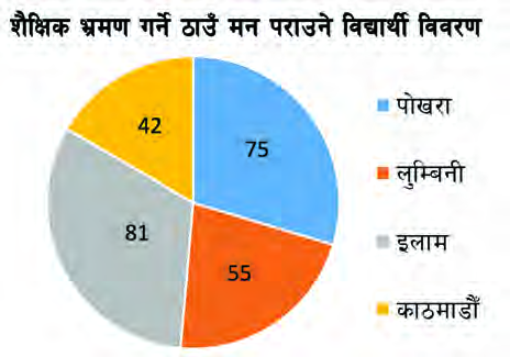
When the total does not divide 360 exactly, the angles come out with decimals. A protractor cannot mark a decimal angle, so each angle is rounded to the nearest whole degree. Asked where they wanted to go on a school trip, 253 students chose like this: Pokhara 75, Lumbini 55, Ilam 81 and Kathmandu 42.
Step 1: Sharing 360° over 253 students, the angle for one student is:
\[ \left(\frac{360}{253}\right)^\circ \]
Step 2: The angle for the 75 who chose Pokhara, rounded off:
\[ \left(\frac{360}{253}\right)^\circ \times 75 = 106.7^\circ = 107^\circ \]
Step 3: The angle for the 55 who chose Lumbini:
\[ \left(\frac{360}{253}\right)^\circ \times 55 = 78.3^\circ = 78^\circ \]
Step 4: The angle for the 81 who chose Ilam:
\[ \left(\frac{360}{253}\right)^\circ \times 81 = 115.3^\circ = 115^\circ \]
Step 5: The angle for the 42 who chose Kathmandu:
\[ \left(\frac{360}{253}\right)^\circ \times 42 = 59.8^\circ = 60^\circ \]
Step 6: Checking the rounded angles by adding them:
\[ 107^\circ + 78^\circ + 115^\circ + 60^\circ = 360^\circ \]
After rounding, always add the angles up. If they come to 359° or 361°, adjust one angle by a degree so the total is 360°, otherwise the sectors will either leave a gap or overlap.
Reading the Angles to Find the Numbers
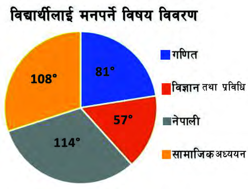
Sometimes the sectors of a pie chart carry angles rather than counts. If the total is known, each count can be worked back out of its angle. This is the same job as before, run backwards. The chart below came from asking 480 students of Janata Secondary School which subject they liked.
Step 1: Since 360° stands for all 480 students, the number of students that 1° stands for is:
\[ \frac{480}{360} = \frac{4}{3} \]
Step 2: The Nepali sector is 114°, so the number of students who like Nepali is:
\[ 114 \times \frac{4}{3} = 152 \]
Step 3: The mathematics sector is 81°, so:
\[ 81 \times \frac{4}{3} = 108 \]
Step 4: The science and technology sector is 57°, so:
\[ 57 \times \frac{4}{3} = 76 \]
Step 5: The social studies sector is 108°, so:
\[ 108 \times \frac{4}{3} = 144 \]
Step 6: Nepali is liked by the most students, 152, and science and technology by the fewest, 76, so the difference is:
\[ 152 - 76 = 76 \]
Step 7: The percentage of students who like mathematics:
\[ \frac{108}{480} \times 100\% = 22.5\% \]
Step 8: The percentage of students who like science and technology:
\[ \frac{76}{480} \times 100\% = 15.8\% \]
The Mean
Twelve students of class 8 went out for a snack. Some ate something expensive, some something cheap. At the end they agreed to share the whole bill equally. The equal amount each one then pays stands for the whole group's spending. That single representative value is the mean.
Mean: the value obtained by dividing the sum of the data by how many items there are. It is also called the average or the arithmetic mean, and is written as \( \bar{X} \).
If the data are written as \( X \), their sum is written \( \Sigma X \), and if there are \( n \) items the mean is found like this.
\[ \bar{X} = \frac{\Sigma X}{n} \]
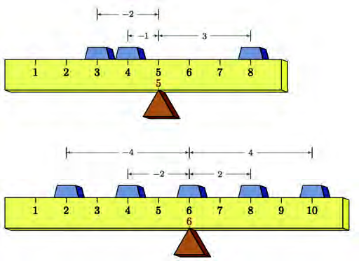
That balance picture shows another meaning of the mean. In the first case the values 3, 4 and 8 are placed, and their mean is 5. To the left of 5 the gaps are 2 and 1, and to the right the gap is 3. The two sides pull equally, so a pivot at 5 balances the beam. In the second case 2, 4, 6, 8 and 10 have mean 6, and the gaps on each side of 6 are 4 and 2. So the mean is the balance point of the data.
In the first term examination seven students scored 4, 12, 13, 21, 12, 12 and 10 in mathematics. We will find their average score.
Step 1: Adding all the scores gives the sum:
\[ 4 + 12 + 13 + 21 + 12 + 12 + 10 = 84 \]
Step 2: There are \( n = 7 \) students, so the mean is:
\[ \bar{X} = \frac{84}{7} = 12 \]
So the average score is 12. When the mean is known, a missing value can be recovered from it. In an inter house volleyball competition five houses scored 12, 15, 18, \( a \) and 14, and the mean score was 15. We will find \( a \).
Step 1: The sum of all five scores is:
\[ \Sigma X = 12 + 15 + 18 + a + 14 = 59 + a \]
Step 2: Putting \( n = 5 \) and \( \bar{X} = 15 \) into the formula for the mean:
\[ 15 = \frac{59 + a}{5} \]
Step 3: Multiplying both sides by 5:
\[ 75 = 59 + a \]
Step 4: Taking 59 from both sides:
\[ a = 16 \]
The Median
When the potted plants in a school garden are set out in a row from shortest to tallest, one plant falls exactly in the middle. It has as many plants in front of it as behind it. That middle value is the median.
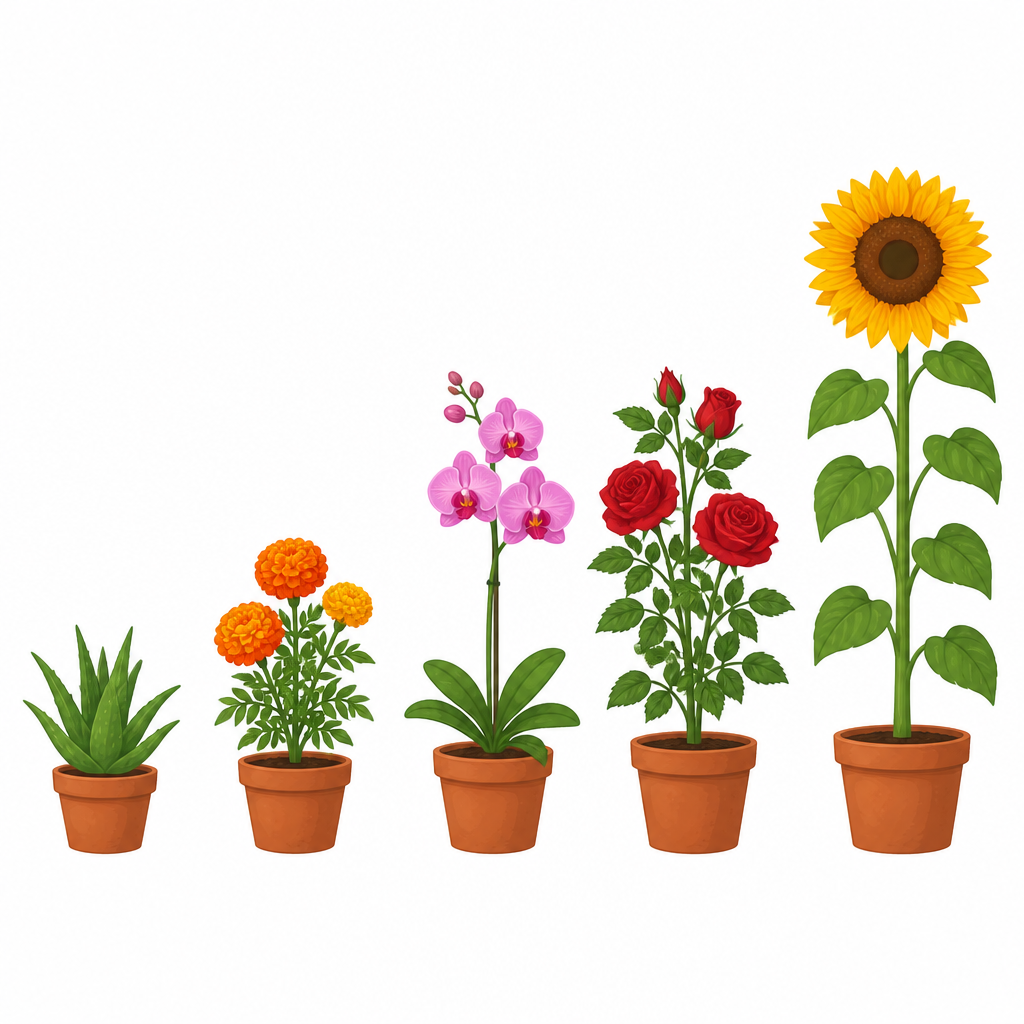
Suppose those five plants, pots included, stand 50 cm, 75 cm, 85 cm, 95 cm and 115 cm tall. In order, the 85 cm plant sits in the middle, so the median height is 85 cm. Arranging them from tallest to shortest instead still leaves the same plant in the middle, so reversing the order does not change the median.
Median: the value that divides ordered data into two equal halves. It is written as \( M_d \).
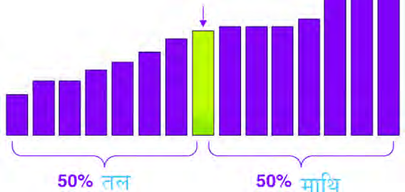
If the number of items \( n \) is odd, exactly one item sits in the middle, and it is the \( \left(\frac{n+1}{2}\right) \)th item. The value of that item is the median.
If \( n \) is even, two items share the middle instead of one. They are the \( \frac{n}{2} \)th item and the \( \left(\frac{n}{2}+1\right) \)th item. The median is then the arithmetic mean of those two values.
Always put the data in increasing or decreasing order before finding the median. Picking the middle value straight out of the order the data were given in gives a wrong answer.
Seven students of class 4 were asked how many pencils they had, and the answers were 5, 11, 14, 9, 12, 7, 16. We will find the median.
Step 1: Putting the data in increasing order:
\[ 5,\ 7,\ 9,\ 11,\ 12,\ 14,\ 16 \]
Step 2: Here \( n = 7 \) is odd, so the position of the median is:
\[ \frac{n+1}{2} = \frac{7+1}{2} = 4 \]
Step 3: Reading off the 4th item of the ordered list:
\[ M_d = 11 \]
Now take the case where the count is even. Eight students weigh 45 kg, 42 kg, 44 kg, 50 kg, 45 kg, 48 kg, 40 kg and 43 kg. We will find the median.
Step 1: Putting the weights in increasing order:
\[ 40,\ 42,\ 43,\ 44,\ 45,\ 45,\ 48,\ 50 \]
Step 2: Here \( n = 8 \) is even, so the first of the two middle positions is:
\[ \frac{n}{2} = \frac{8}{2} = 4 \]
Step 3: The second of the two middle positions is:
\[ \frac{n}{2} + 1 = 4 + 1 = 5 \]
Step 4: The 4th item is 44 kg and the 5th is 45 kg, so their mean is:
\[ M_d = \frac{44 + 45}{2} = 44.5 \]
So the median weight is 44.5 kg. Notice that the median need not be one of the values in the data. When the count is even it can fall between two of them.
The Mode
The class 8 students of Sagarmatha Secondary School were asked their shoe sizes, and the answers were 5, 6, 6.5, 7, 5.5, 5, 6, 6, 5.5, 5, 6, 6, 7, 6, 5, 6.5, 7. A shoe seller wants to know which size to order most of, and that is answered neither by the mean nor by the median, but by the value that repeats most often.
Mode: the value that occurs most often in a set of data.
Step 1: Counting how often each size appears, size 5 comes four times, 5.5 twice, 6 six times, 6.5 twice and 7 three times.
Step 2: The size that repeats most often is 6, so:
\[ \text{Mode} = 6 \]
Take another example. Ten students of class 8 are 145 cm, 149 cm, 140 cm, 148 cm, 142 cm, 149 cm, 142 cm, 155 cm, 150 cm and 149 cm tall. We will find the mode.
Step 1: Putting the heights in increasing order so that counting is easy:
\[ 140,\ 142,\ 142,\ 145,\ 148, \]
\[ 149,\ 149,\ 149,\ 150,\ 155 \]
Step 2: Three students are 149 cm tall, which is more than for any other height. So:
\[ \text{Mode} = 149 \]
So the mode is 149 cm.
Do not leave the unit off, because the mode of a set of heights is itself a height.
Mean, Median and Mode of One Set of Data
All three values can be found from the same data, and each of them says something different. We will find all three from 15, 20, 18, 16, 18, 16, 18.
Step 1: Adding all the values gives the sum:
\[ 15 + 20 + 18 + 16 + 18 + 16 + 18 \]
\[ = 121 \]
Step 2: There are \( n = 7 \) values, so the mean, rounded to one decimal place, is:
\[ \bar{X} = \frac{121}{7} = 17.3 \]
Step 3: To find the median, first put the data in increasing order:
\[ 15,\ 16,\ 16,\ 18,\ 18,\ 18,\ 20 \]
Step 4: Since \( n = 7 \) is odd, the median is the value of the 4th item:
\[ M_d = 18 \]
Step 5: The value 18 appears three times, 16 twice and the rest once each, so the mode is:
\[ \text{Mode} = 18 \]
| Value | What it says | When it is useful |
| Mean | What each item gets if the total is shared equally | When one representative of all the values is wanted |
| Median | The value in the exact middle once the data are ordered | When one very large or very small value drags the mean |
| Mode | The value that repeats most often | When the most common size or choice is wanted |
The mean is adding and dividing, the median is ordering and picking the middle, and the mode is counting. The question itself tells you which of the three it wants.
The full lesson is waiting for you
The notes are free to read in full. A free account opens the rest of the practice, and tracks your progress and confidence score for every subject. Presentations and videos need approval from Learn Yeti.