Reading information set out in a table
Sarita wrote down how much of each food item her house used during one whole month. Written out as sentence after sentence, that information is slow to use, so it is set out in a table instead. Each row of the table carries one item and the amount of it that was used, and every amount is written with its unit. A reader can then find any single item at once, without reading through the whole page.
| S.N. | Food item | Quantity used |
| 1 | Potato | 12 kg |
| 2 | Rice | 45 kg |
| 3 | Lentils | 8 kg |
| 4 | Sugar | 4 kg |
| 5 | Salt | 2 kg |
| 6 | Beaten rice | 6 kg |
| 7 | Spices | 1 kg |
The table now answers a good many questions on its own. The largest amount in the last column is 45 kg of rice, so rice is the item this house uses most. The smallest amount is 1 kg of spices, so spices are used least. The sugar row shows that 4 kg of sugar goes in a month. To find how much food the house used altogether, every amount in the last column is added:
\[ 12 + 45 + 8 + 4 + 2 + 6 + 1 = 78 \]
So this house uses 78 kg of food in a month. Notice what the table did. It did not create any new information. It only arranged the information that was already collected so that a reader can use it.
Data and raw data
Any information collected about a subject, by asking, by measuring or by counting, is called data in mathematics. Asking classmates which vegetable they like, measuring the heights of students, noting down the daily wages of workers in a factory: each of these is a collection of data.
While it is being collected it is written down in whatever order the answers arrive, with no sorting of any kind.
Information collected about a subject is called data.
Data just as it was first collected, arranged in no order at all, is called raw data.
The number of times a value repeats itself in the collected data is called the frequency of that value.
A table that shows the collected data with tally marks and frequencies is called a frequency table.
Raw data on its own says very little. Only after it is put into a frequency table can you see what occurs most, what occurs least and how many entries there are altogether.
How tally marks are written
When a list holds thirty or forty entries, counting each answer in your head goes wrong very easily. So a mark is made while the counting is going on. Every time an answer appears, one upright stroke is put down in its row. After four strokes, the fifth stroke is drawn across those four, and that makes a bundle of five. Such a bundle is written here as ||||/ . Bundles make the final count quick, because you count the bundles in fives and then add the loose strokes left over.
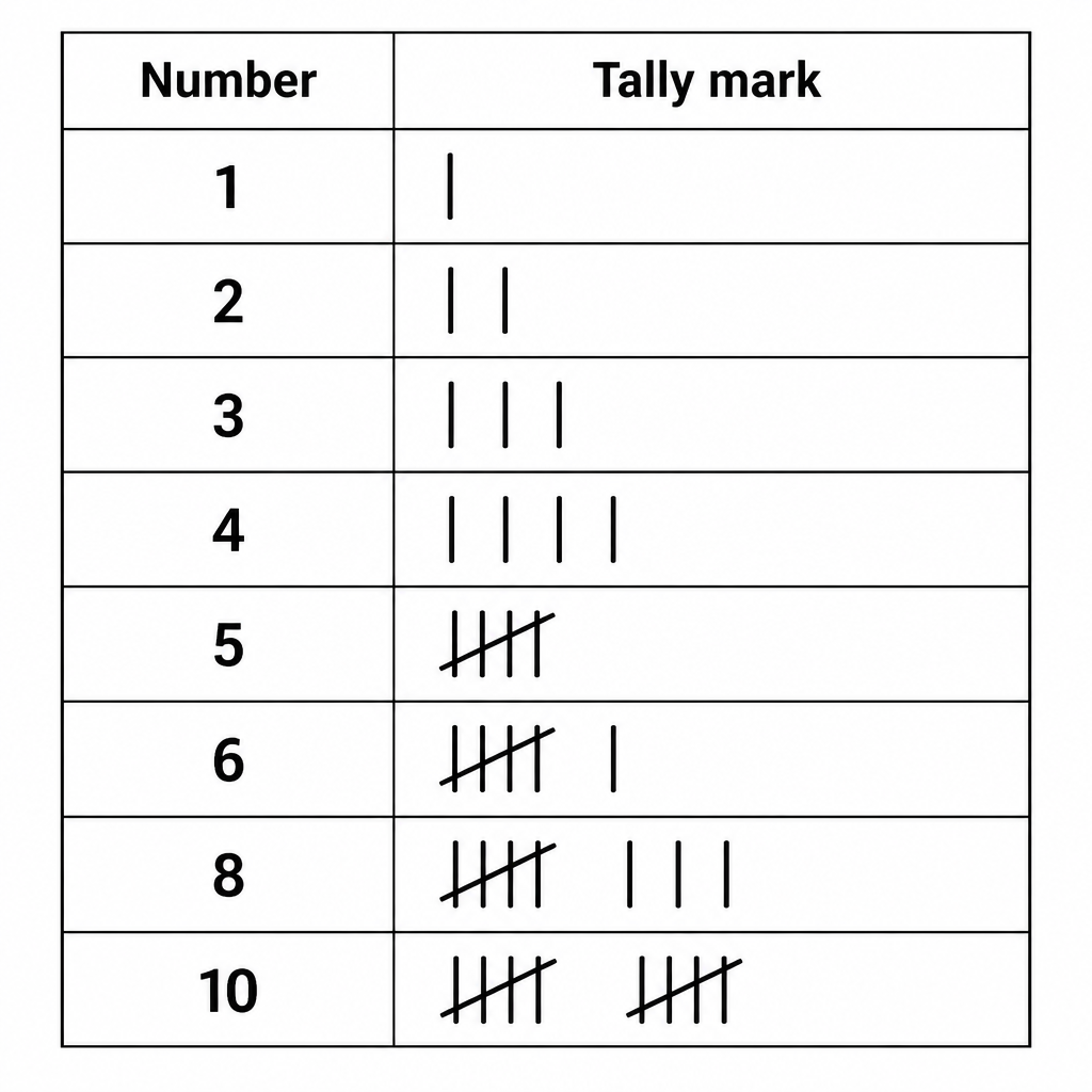
Writing the fifth stroke upright beside the other four spoils the count. The fifth stroke must always be drawn across the four before it. Also, once an entry in the list has been marked, never mark it a second time, or the total of the frequency column will not match the number of entries.
Making a frequency table
A shoe shop wrote down the size of every pair of school shoes it sold in one day. This is raw data, because the sizes are written in the order the pairs were sold and in no other order:
- 5, 4, 3, 5, 6, 4, 5, 3, 4, 7
- 5, 5, 4, 6, 3, 5, 4, 7, 5, 4
- 3, 6, 5, 4, 5, 6, 4, 3, 7, 5
To put this into a frequency table, work through the following order.
- Write the different sizes in the first column, from the smallest to the largest.
- Go through the list in the order it was written, and for each entry put one stroke in the row of that size.
- Make bundles as you go, crossing every fifth stroke over the four before it.
- Count the strokes in each row and write that number in the frequency column.
- Add the frequency column, and check that the total is equal to the number of entries in the data.
| Shoe size | Tally mark | Frequency |
| 3 | ||||/ | 5 |
| 4 | ||||/ ||| | 8 |
| 5 | ||||/ ||||/ | 10 |
| 6 | |||| | 4 |
| 7 | ||| | 3 |
| Total | 30 |
The last step is the check, and it is done by adding the frequency column:
\[ 5 + 8 + 10 + 4 + 3 = 30 \]
The list held 30 entries and the frequency column also totals 30, so the counting is correct. The table now gives these answers straight away.
- (a) The size sold most is 5, and 10 pairs of it were sold.
- (b) The size sold least is 7, and only 3 pairs of it were sold.
- (c) The shop sold 30 pairs of shoes altogether that day.
The simple bar diagram
A table gives the numbers, but a picture is better when the numbers have to be compared by eye. For that, upright rectangles are used, and the height of each rectangle stands for the frequency of that item. A taller rectangle simply means a larger number.
A diagram in which data is shown by rectangular bars, the height of each bar standing for the frequency of that item, is called a bar diagram.
Four things must be looked after while a bar diagram is being drawn.
- The X axis and the Y axis must both be drawn clearly and named.
- Every bar diagram must carry a title.
- Every bar must have the same width.
- The gap between any two bars must be the same.
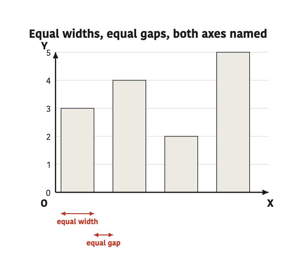
If one bar is drawn narrow and the next one wide, the wide bar looks bigger and the diagram tells a lie about the data. Keep both the widths and the gaps equal, and mark the Y axis in equal jumps only.
Drawing a bar diagram step by step
On tree planting day the students of classes 6 to 10 of a school planted the following numbers of trees. The steps below show this data as a simple bar diagram.
| Class | 6 | 7 | 8 | 9 | 10 |
| Trees planted | 30 | 45 | 25 | 40 | 35 |
Step 1: The two axes are drawn on graph paper and named. The classes go along the X axis and the number of trees goes up the Y axis.
Step 2: The largest value is 45, so one small square on the Y axis is taken to stand for 5 trees, and the axis is marked in equal jumps of 5, 10, 15 and so on.
Step 3: The tallest bar belongs to class 7. Dividing 45 trees by the scale gives its height in small squares:
\[ 45 \div 5 = 9 \]
Step 4: Class 6 planted 30 trees, so the height of its bar is:
\[ 30 \div 5 = 6 \]
Step 5: The heights of the other three bars are found in the same way:
\[ 25 \div 5 = 5 \]
\[ 40 \div 5 = 8 \]
\[ 35 \div 5 = 7 \]
Step 6: All five bars are drawn with the same width and with equal gaps between them, the bars are coloured, and the title is written above the diagram.
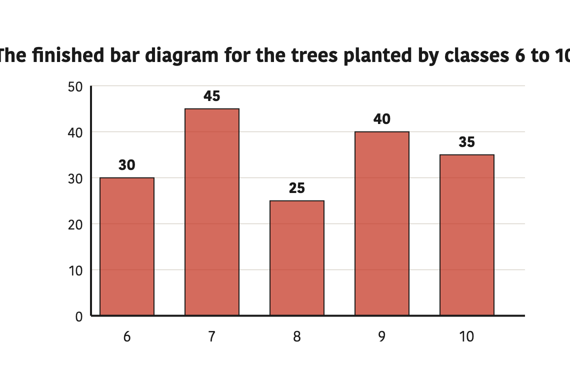
Once the diagram is finished, adding the values of all the bars and checking them against the data is a good habit:
\[ 30 + 45 + 25 + 40 + 35 = 175 \]
So 175 trees were planted in that school altogether.
Reading a bar diagram and turning it back into a table
To read a finished bar diagram, look across from the top of a bar to the Y axis, and the number written there is the value of that bar. Below, the population of a town over six years is shown in lakh.
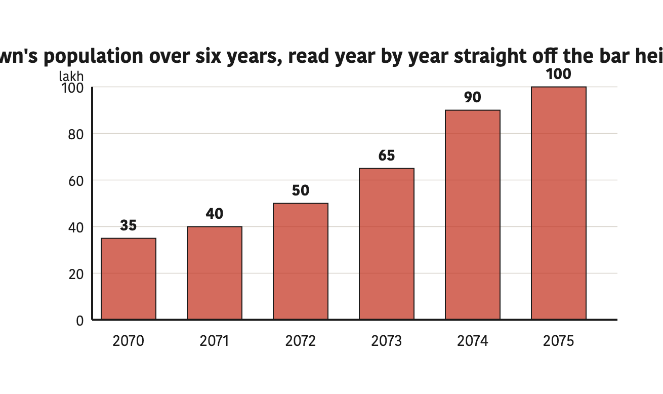
The tallest bar is the one for 2075, so the population was largest in that year at 100 lakh. The bar for 2072 reaches 50, so the population that year was 50 lakh. To find the rise from one year to the next, the two values are subtracted. The rise from 2073 to 2074, for example, is:
\[ 90 - 65 = 25 \]
In the same way, the rise from 2070 to 2071 is:
\[ 40 - 35 = 5 \]
Comparing the rise for every year, this 5 lakh is the smallest of them, so the smallest rise came in 2071 and it was 5 lakh. Writing the values read off the bars back into a table gives the frequency table again, which shows that you can travel both ways, from table to diagram and from diagram to table.
| Year | Population (in lakh) |
| 2070 | 35 |
| 2071 | 40 |
| 2072 | 50 |
| 2073 | 65 |
| 2074 | 90 |
| 2075 | 100 |
Work with data goes in three stages. First it is collected, then it is put into a frequency table with tally marks, and then it is drawn as a bar diagram. The data itself stays the same at every stage. Only the way of looking at it changes.
The full lesson is waiting for you
Create a free account to unlock activities, practice tests, presentations and videos - and to track your progress and confidence score for every subject.
Information collected about a subject is called data.
11 more points to remember - sign in to see the rest.
Question 1 of 12